The magazine I will be creating is a music magazine based around alternative rock. It is aimed at an audience between the ages of 21-24 and specifically the ABC1 readership. Its ideal reader is male, in a comfortably paid job with a good education to earn a safe living. They are living in either a flat or their first house and still have the time to follow the latest rock/pop music scene. Shopping at places like Tesco, still buying their music from HMV and regular night outs with ‘the lads’ to talk about music and other subjects such as gadgets and football. They don’t earn enough money to splash out on expensive items but still keeps disposable income aside for him to spend on luxuries including this magazine. The magazine would include advertisements such as TVs, new music releases, gigs and activity days out. These would appeal to the ideal reader who saves their money, but earns enough to treat themselves regularly on cheaper items such as CDs. The magazine focuses on providing all the latest on the alternative rock scene, and occasionally looking into other rock scenes when appropriate. The cover star takes up most of the cover and other bands/artists are provided in the cover line to tell the buyer who's inside the issue. The rest of the cover will consist of stand out quotes, pictures and information about what to expect for the reader, these parts may be of interest to people who perhaps are not perhaps fans of the cover stars as much, it will also contain a choice of darker colours to appeal both the intended target audience and the male audience (a possible colour choice is dark blue against white). The contents page will then introduce the reader to what the main story of the issue is about followed by which pages to find all the other news, interviews and other music acts on. To achieve this I am going to take my own photos and then edit them in photoshop. Photoshop will also be used to create the end product, editing the photos, text and other conventions of a magazine.


One example of a similar type of magazine is Q magazine. It appeals to younger audience interested in music, mainly featuring rock/pop stars as the cover stars, a catchy headline which consists of their name, a pun or a quote to gain interest to the buyer in the shop. The use of colours show it appeals to people who are serious about music and to a young adult audience as no bright colourful colours are used. The red, black, simple and bold texts continue to the idea of seriousness. The cover lines then normally go on to tell the reader who else appears in the issue plus they have a very recognisable masthead, enough so that in some issues to the cover star overlays it because they are confident they have a devoted fan base for the magazine and that its recognisable enough to everyone interested in the music magazine. The cover stars and layout of the cover vary from issue to issue depending on the type of band/artist they are. This can be serious with a darker background to suit or a happy picture with font colours matching to it. The contents page often is arranged similarly each issue, in a list in a side column but also uses images with no text to indicate where an article is, this is mainly used for the cover stars and other more well-known acts and it takes up about half of the contents page. With each page indicated there is also a short description about what to expect in this section of the magazine. Its use of colour follows the serious manner from the cover.

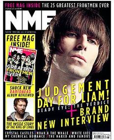


Another example is NME, a magazine aimed at a young audience once again, focusing this time on new music. This magazine is a weekly issue is cheaper than Q magazine which is a monthly magazine, this cheaper price appeals to the younger audience because they will have less money. The cover is often of a darker tone to appeal to a young adult audience who don’t want bright colours as it would make the magazine appear too young for them. The cover star is often not smiling to show the serious take they have on providing readers with their weekly news on music. The magazine follows all the main factors of a magazine, with its cover line, large and bold headline and well-known masthead. The contents page of NME is very simply made mainly consisting of images to tell the reader which page anything is, they have a small section at the bottom however which indicates which pages to find whole sections on as opposed to individual artists/interviews as this magazine is a news magazine, its contents are set out in a way to a newspaper with its regular features rather than each story itself, this is because NME did begin as a newspaper about music. It is also not set out as much a list and spread across the whole page with colours of black and white which say ‘it’s only here to give you the music news and nothing else’.
No comments:
Post a Comment